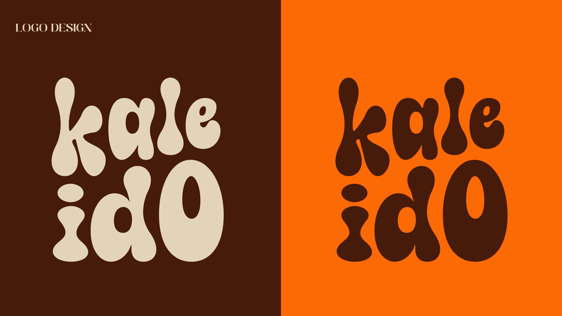
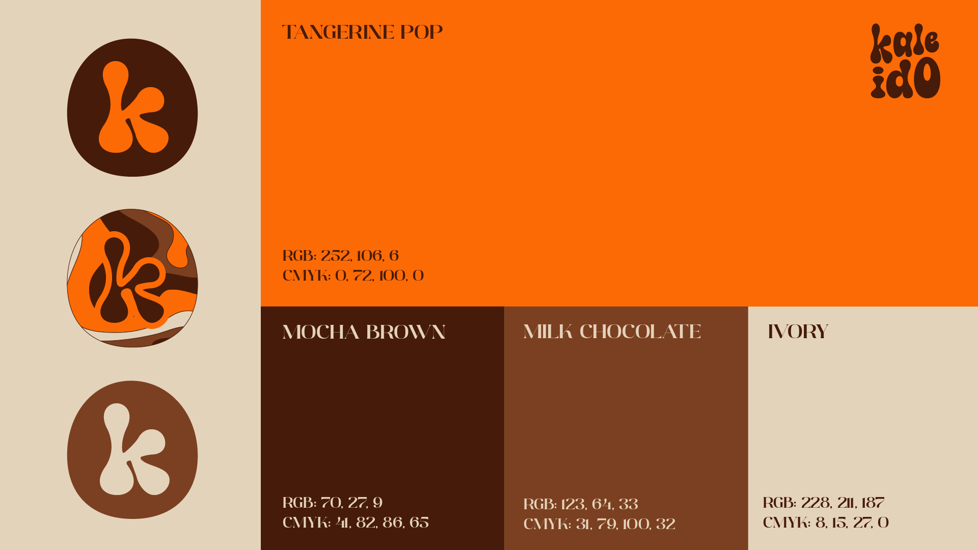
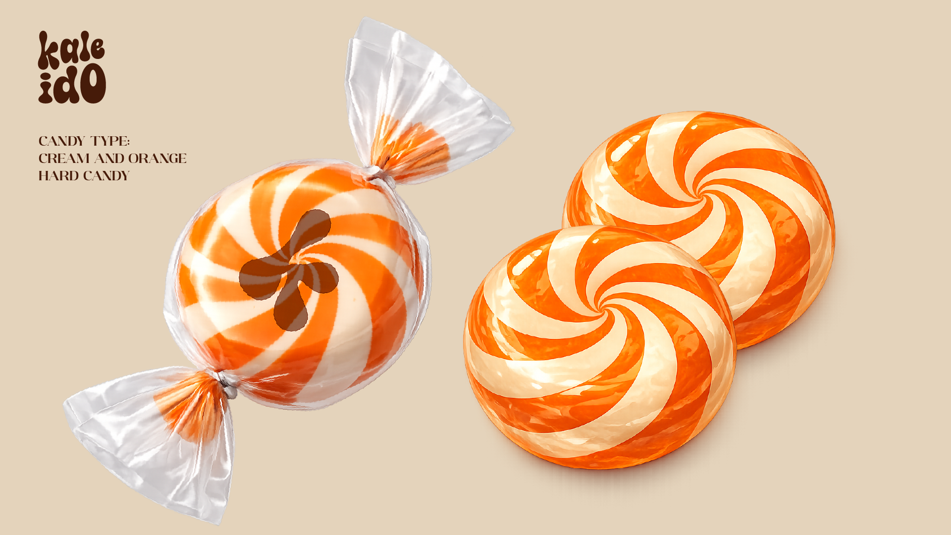
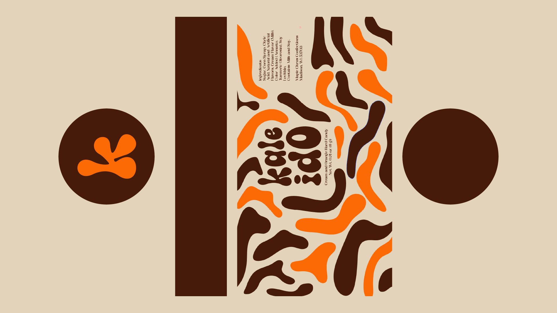
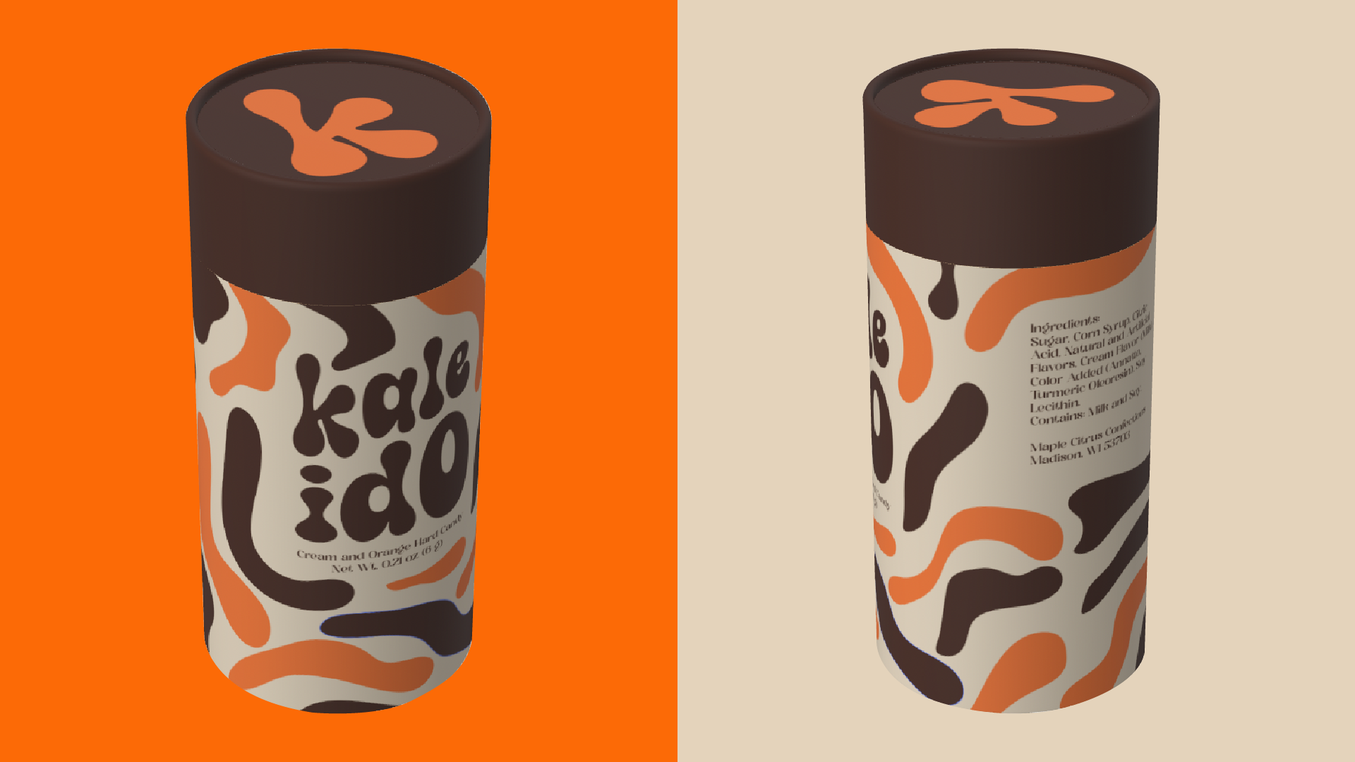
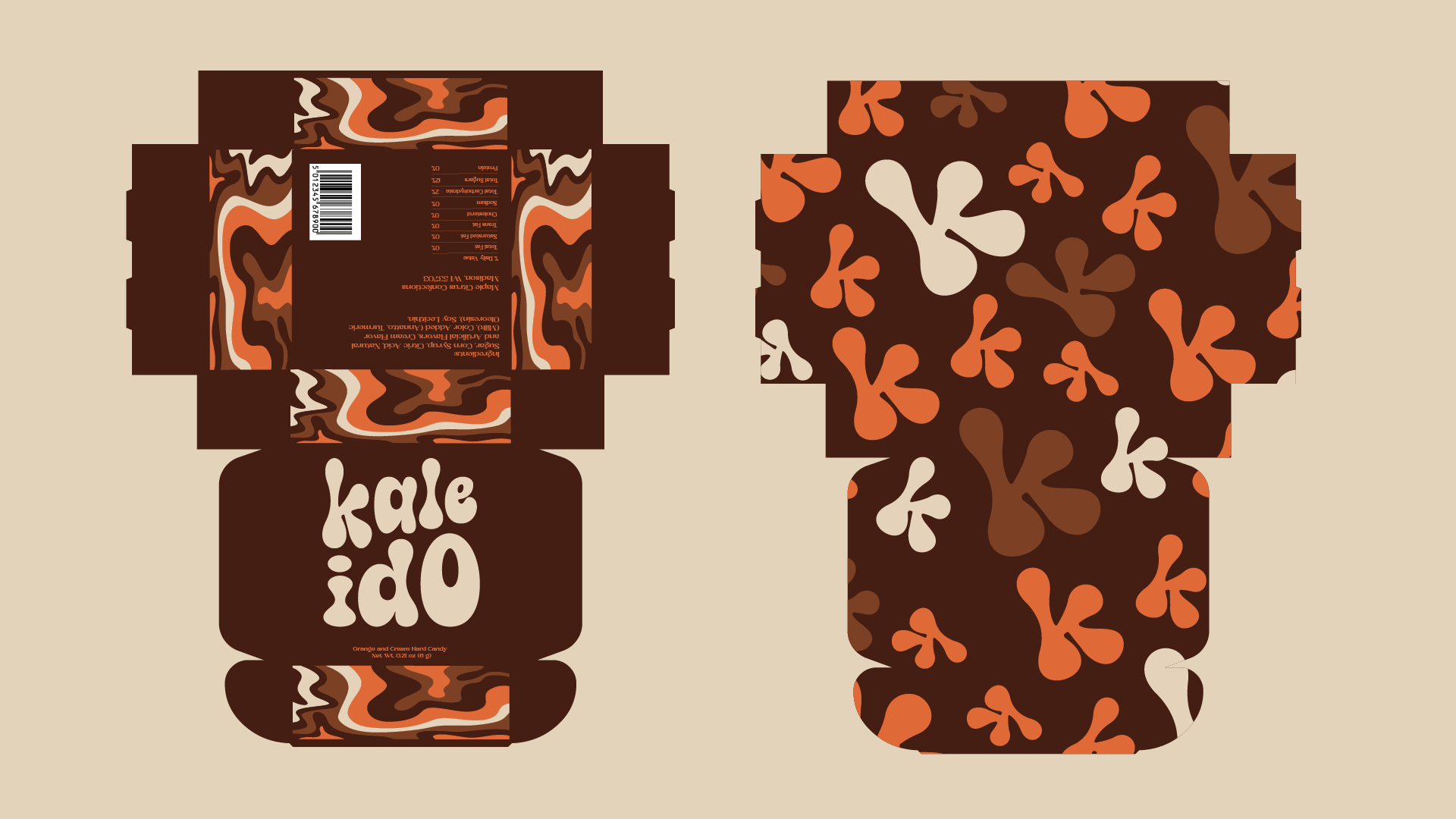
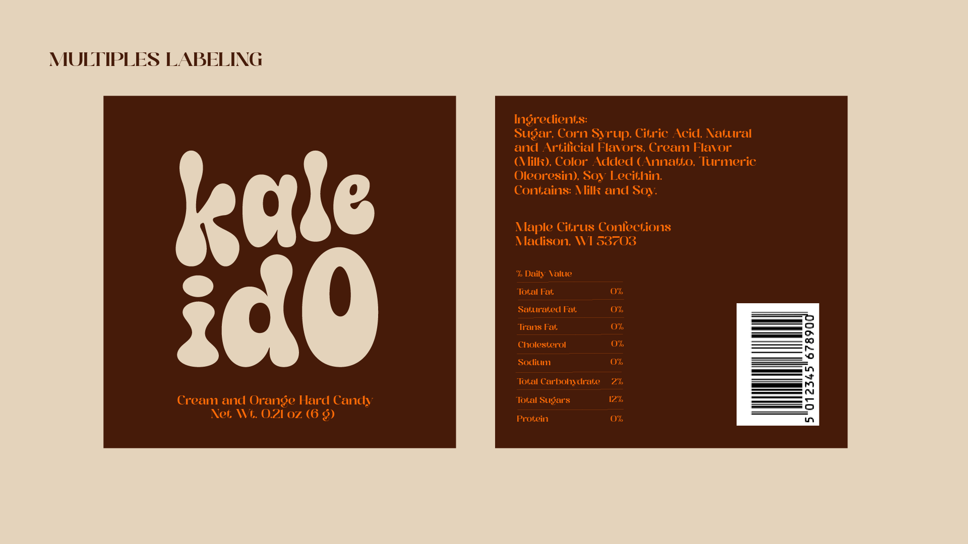
Kaleido
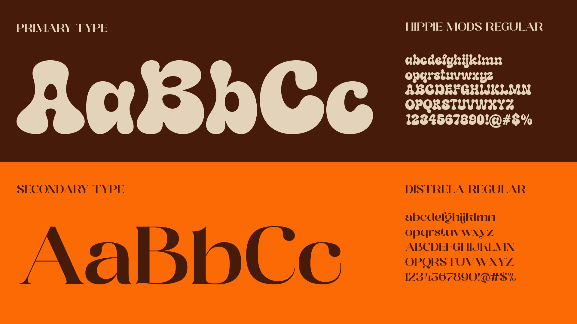
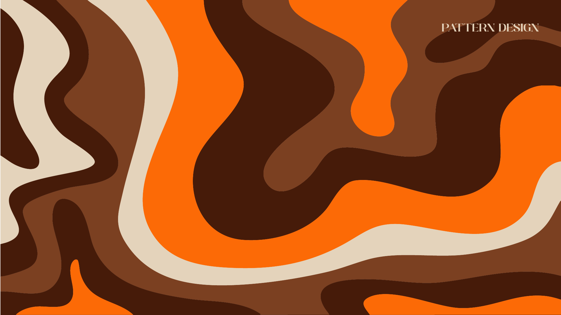
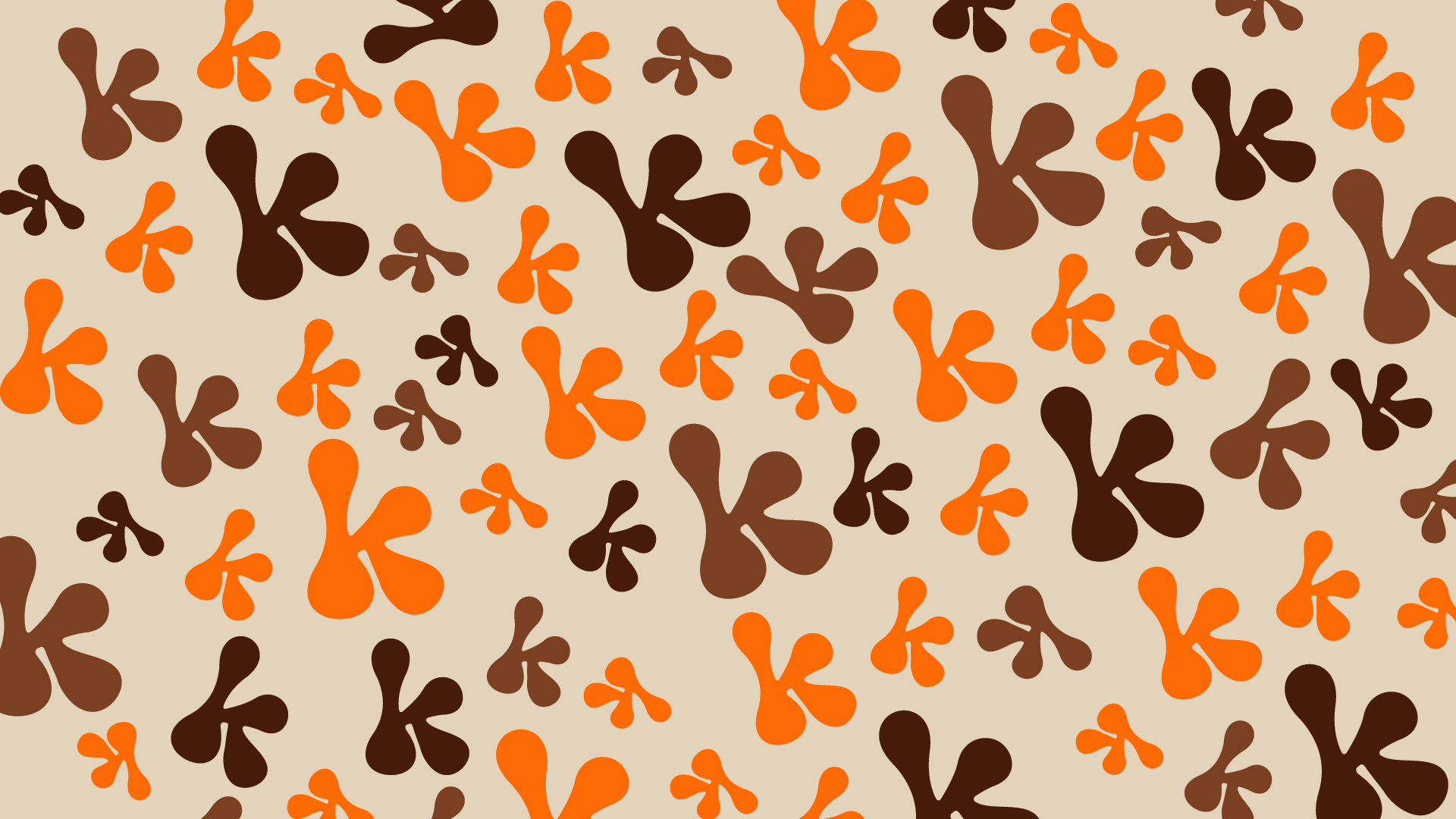
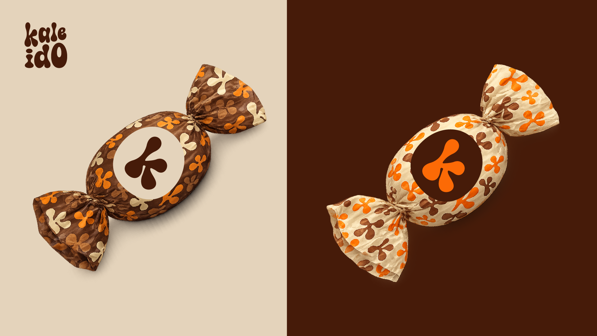
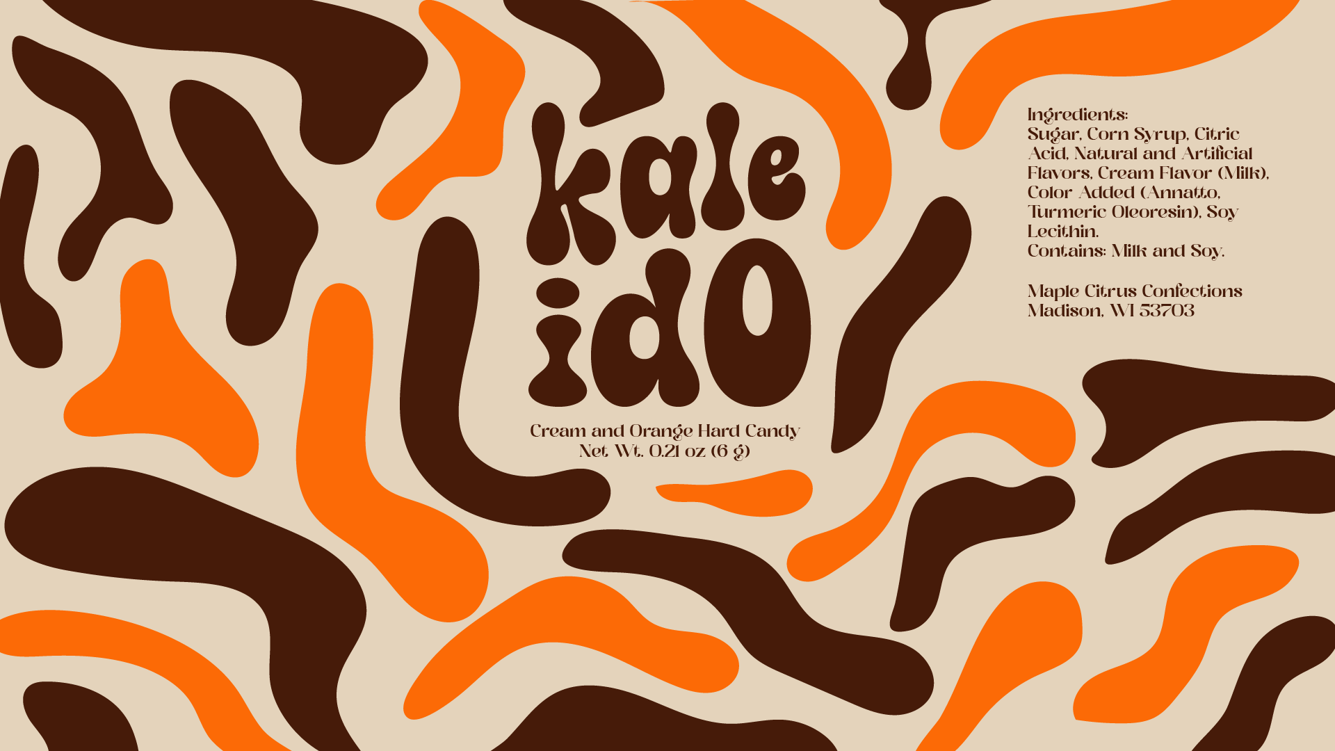
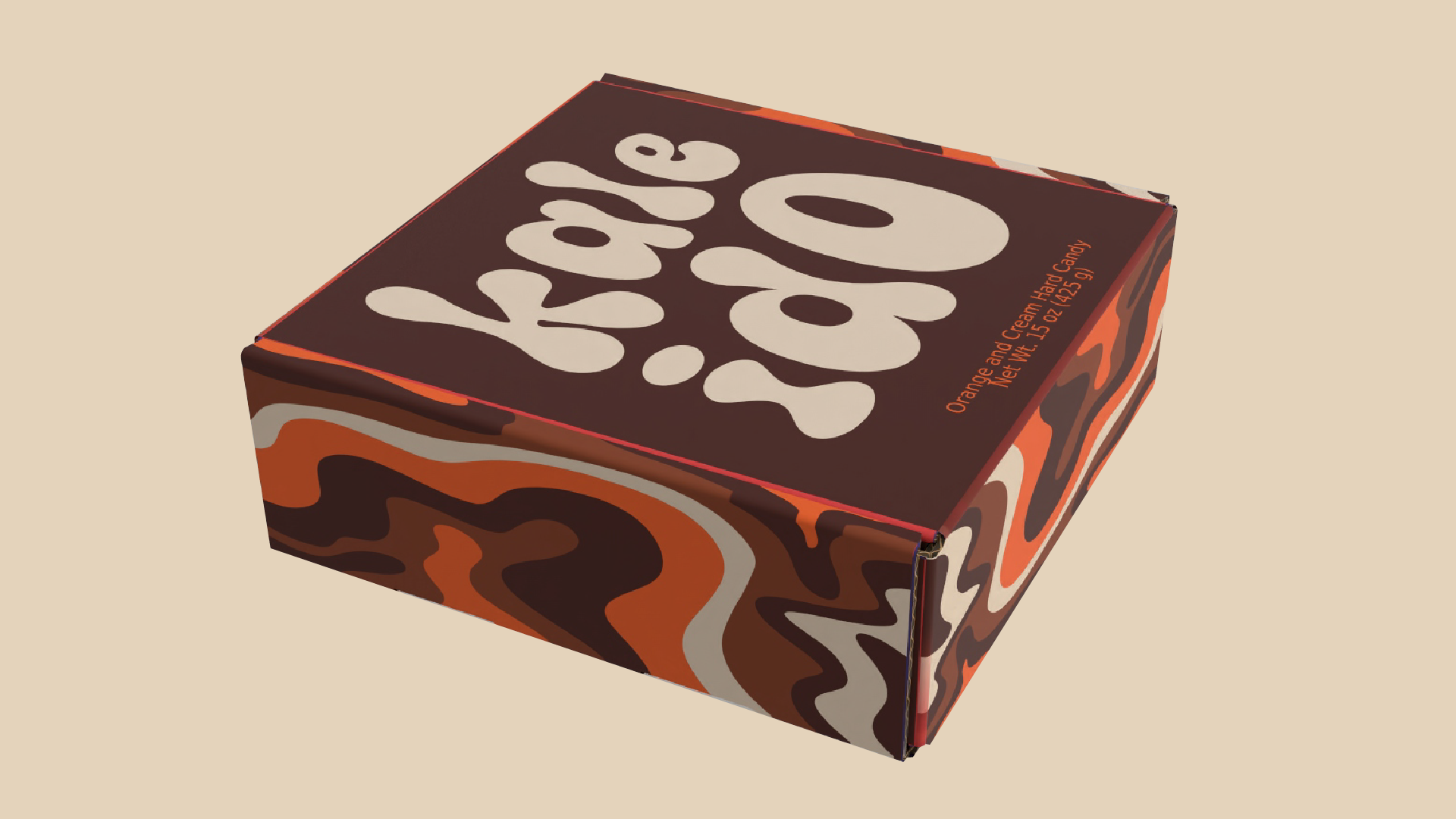
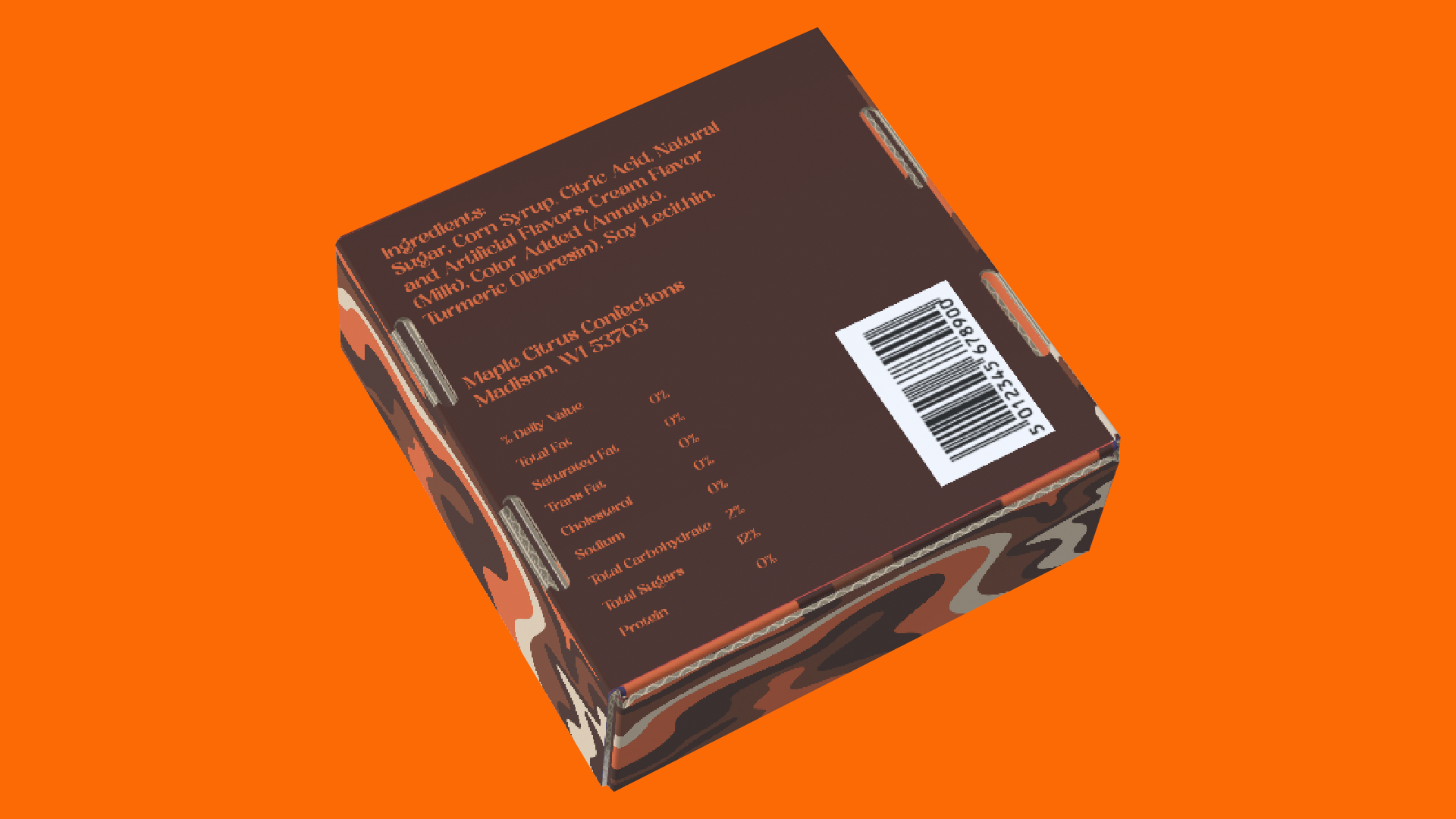
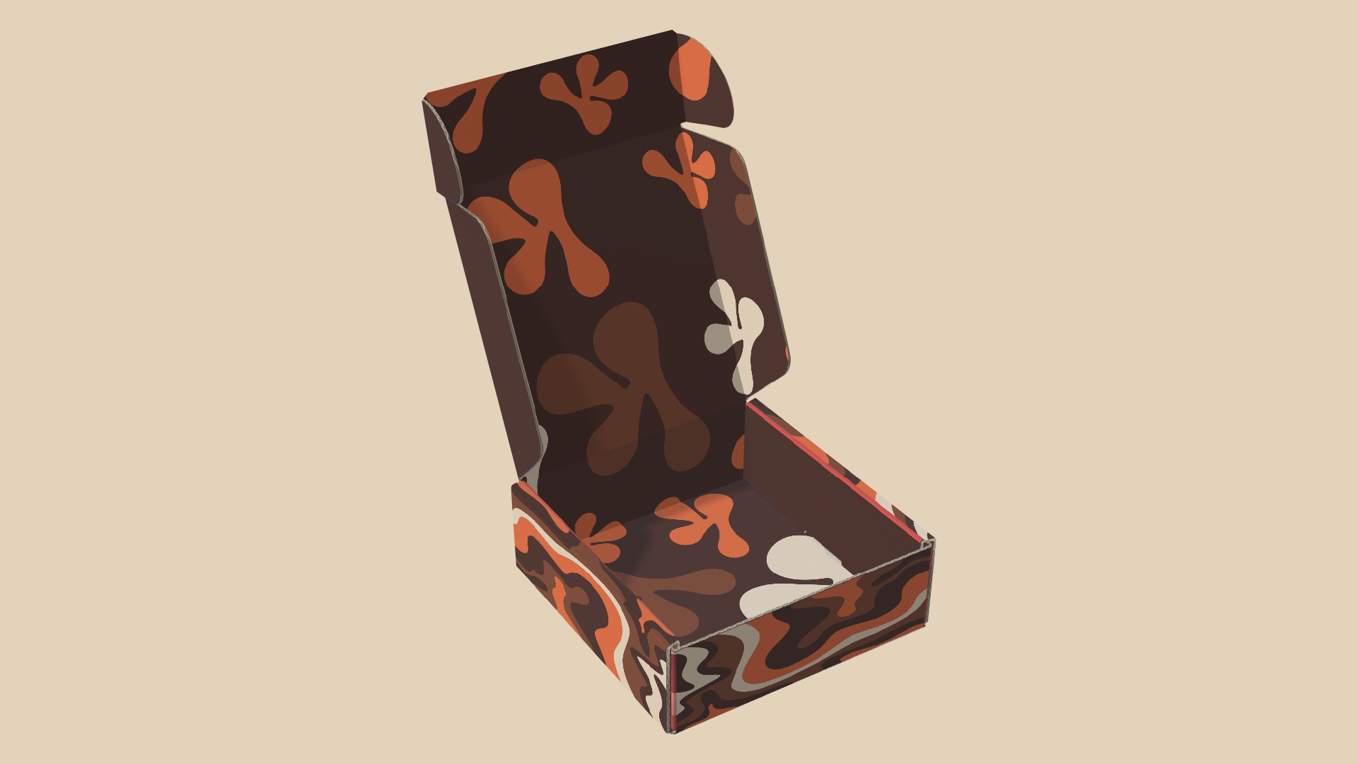
This candy brand melts sweetness with a blend of color, inspired by the psychedelic art movement. Orange and cream swirl hard candies spin like tiny Kaleidoscopes, which became the visual inspiration behind the brand name: Kaleido. The candy itself replicates a hypnotic style swirl reminiscent of the 60s, with the outer wrapping remaining transparent to highlight those designs. It is a nostalgic sugar rush with a trippy, visual twist. The two main features I was able to extract from this art movement was swirl pattern imagery and two-tone vibrant color palette. This became the basis for the brand to adopt two main colors: orange and brown, while the packaging patterns drew from the organic movement of the swirl patterns.
Package Design Presentation Deck